A Brand With a Story to Tell
- Melissa Heckel

- Jan 14, 2022
- 2 min read
Updated: Mar 31, 2023
Sometimes when a family business moves to a new city in a new state, a rebrand is in order. That was the case for Parable Coffee Co. The company, formerly known as Wollman Coffee Roasters based out of Bemidji, MN, was making a move to the Sioux Falls area and ready to make a change to better position themselves for launching in a new market.
Behind the Name
The new name "Parable" by definition means: a simple story used to illustrate a moral or spiritual lesson, as told by Jesus in the Gospels. They wanted to create a modern look with a simple, memorable name that was also a nod to their deep rooted faith.
"Parable" is also a reference to how everyone has their own special story (parable) about coffee and how or when they discovered their own way of drinking and enjoying coffee.
We helped them bring their vision to life through:
About the Design
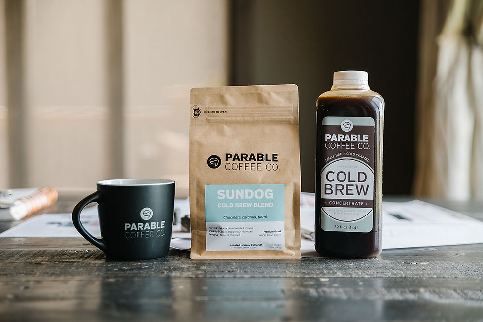
The simple icon incorporates the shape of a coffee bean within the shape of a quotation mark which resembles speaking or stories merged with the product that they sell—coffee. The fonts chosen are clean and modern with an emphasis on the Parable name.
Color Strategy
We kept things simple and straightforward with two primary colors: sage/earthy green and black. When diving into color psychology, green can bring out feelings of freshness, energy (hello caffeine!), health and prosperity. Black brings up feelings of elegance, authority and discipline. All of these feelings and emotions can be tied to a life rooted in faith and a fresh cup of locally roasted coffee made by an expert coffee roaster. Additional colors were chosen for the labels to help distinguish the different coffee flavors.

So, Now I'm Thirsty.
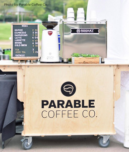
Get your very own cup of Parable Coffee by ordering online, at various retailers across the region, or visit them on Saturdays during the summer at the Falls Park Farmer's Market!


